other:python:maps_by_jyp
This is an old revision of the document!
Table of Contents
JYP's map room
You will find below a gallery of maps made with cartopy.
This page is under construction and its content may change drastically. The source codes are on LSCE servers, that you can hopefully access (too bad otherwise…)
PFT maps
- Summary: plot two PFT maps on a page
- Authors: Camille Contoux & Jean-Yves Peterschmitt
- Date: September 2019
- Script:
~jypeter/CDAT/Progs/Devel/contoux/plot_PFT_plio_pi.py
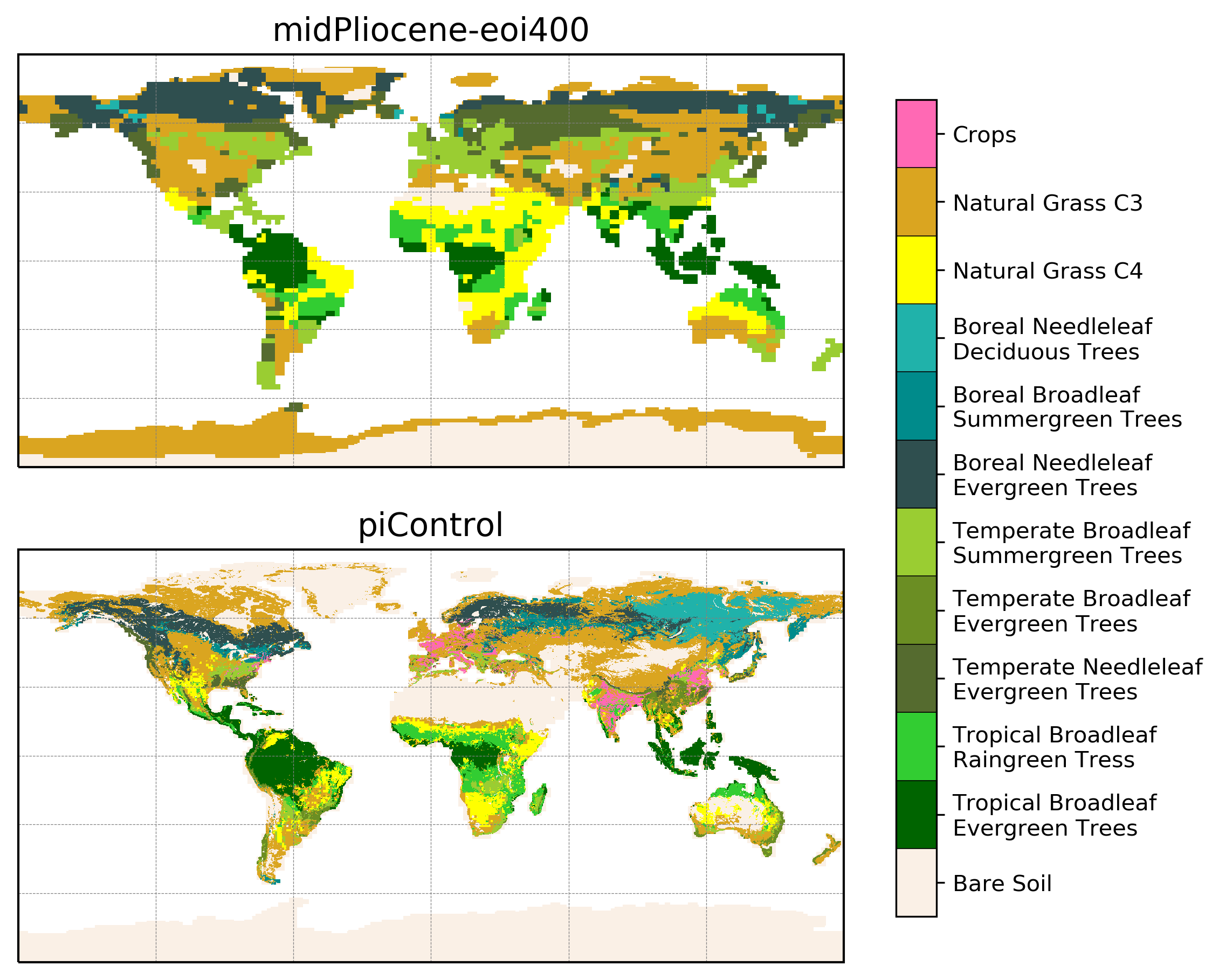
- Load the NetCDF model data with
cdms2 - Optionally reduce the number of PFTs before plotting
- Use
matplotlib+cartopyto create the plot- Create two plots with a PlateCarree projection and a common colorbar
- Use an A4 portrait (
figsize=(8.3, 11.7)) figure size andsubplots_adjustin order to improve the page layout - Use a listed colormap (and the associated norm), and
pcolormeshto plot the discrete PFT values - Use a trick to make sure that the black plot border is correctly plotted above everything (
top_plot.outline_patch.set_zorder(50))
Megabiome maps
- Summary: Plot two megabiome maps based on 2 versions of the IPSL model (CM5 and CM6), and compare them to a map with observations
- Authors: Raj Rani & Jean-Yves Peterschmitt
- Date: September 2019
- Script:
~jypeter/CDAT/Progs/Devel/pasb/PMIP4/Press_Conference_1909/mh_CM6_CM5_megabiome.py
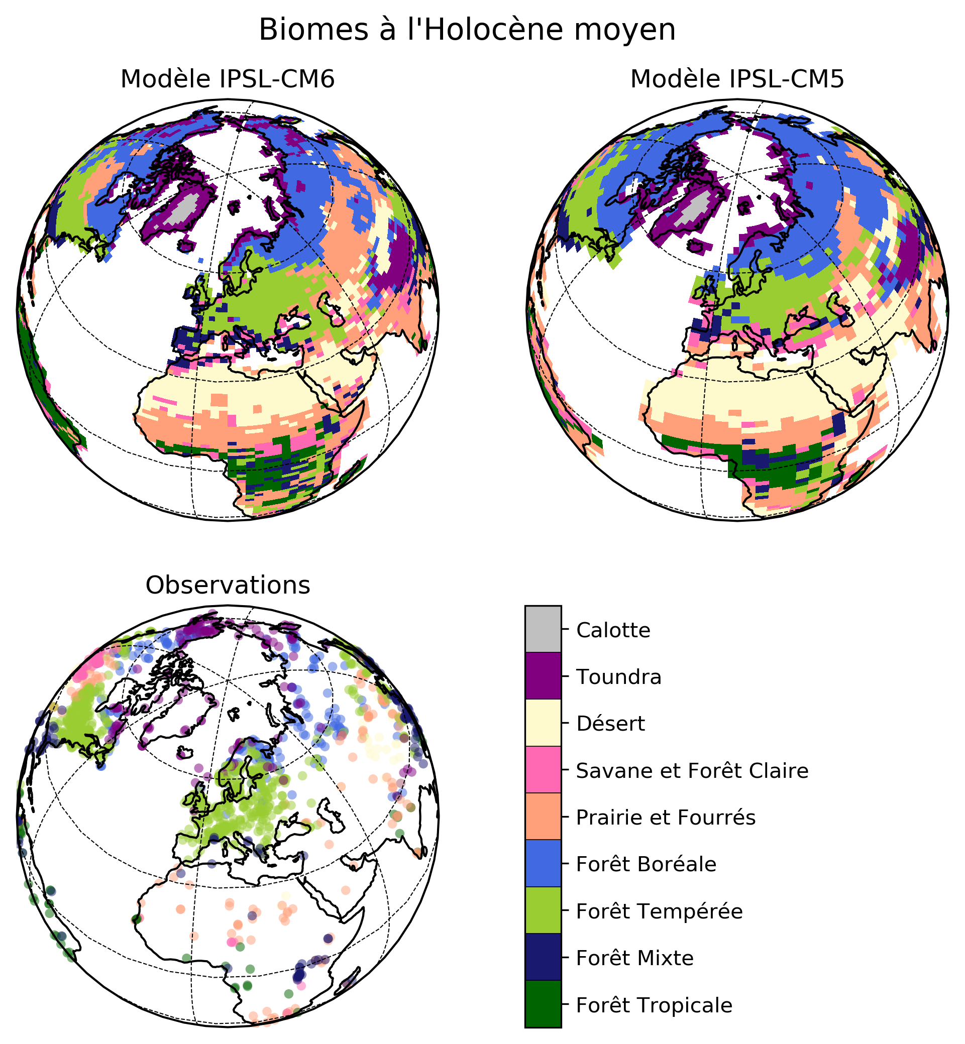
- Load the NetCDF model data with
cdms2, and the csv observations' data withpandas - Use
matplotlib+cartopyto create the plot- Create three plots on a 2×2 layout with an Orthographic projection (centered on Europe) and a common colorbar. Explicitly make the 4th plot invisible in order to make space for plotting the colorbar (
colorbar_plot.background_patch.set_visible(False)andcolorbar_plot.outline_patch.set_visible(False)) - Use a square (
figsize=(8, 8)) figure size in order to improve the page layout - Use the same color scale for both the model data (plotted with
pcolormesh) and the observation data (plotted withscatter) - Use a dictionary trick for easily using the same gridlines parameters for all the maps
- Use a common listed colormap to plot the discrete megabiome values (with a norm associated with the megabiome values) and the observations (with a different norm associated with the observations)
- The three plots have the same colormap, but we create a standalone colormap (created with
mpl.colorbar.ColorbarBase) in the Bottom Left quadrant. We useUR_plot.get_position().boundsto determine the exact location of the Upper Right and Lower Left plots, and combine the coordinates to create the axis (withmy_page.add_axes) where the colorbar will be plotted
[ PMIP3 Wiki Home ] - [ Help! ] - [ Wiki syntax ]
other/python/maps_by_jyp.1568814016.txt.gz · Last modified: by jypeter